LEARNING TO USE PHOTOSHOP
In e-Comm we started a new unit learning about photoshop. We completed 4 images.
And the last project we made was a collage. We started by cropping out a light pole in the background of our schools image. It was a new skill we learned and was a lot of fun. Next, we used the magic lasso tool to outline the raven and put it in front of the school and adjust the blend. I then did that with three other images. And lastly I added a dark boarded with the magic paint bucket tool. Overall, this was the most complicated project, but was definitely my favorite because of all the new skills I learned.
The Idea Behind My Logo
In e-Comm we designed a personal logo using adobe illustrator. I created multiple designs and had many ideas but eventually limited it down to this design. The font of WELLMAN is in Charlemagne Std Bold and was used because it draws your eye to it because it is bold and easy to read. I decided that the main focus of my e-Comm career was going to be video. So using the font Copperplate I added videography underneath the name Wellman. I separated these two words with a horizontal line to add balance and to make it look more put together.Above my last name Wellman I used a cursive L followed by a swirly line to make the logo look more fun and not as serious. But however, in my simplified logo it does not have the cursive L.
The color I used was a dark turquoise because it looks professional with the grey font. The color turquoise is also supposed to make people think of happy, friendly things which describes my personality.
Anatomy of a Font
In class we took a personality test to find out what font fit our personality the most.My font was Courier. My personality for this font was that I am Rational, Understated, Progressive, and Disciplined. Courier has a more sophisticated and old fashioned kind of mood since it is meant to look like a type writer. We then modeled our name in the font we were given and our last name in the font of our choice. I chose the font Century Gothic as my second font in the name Wellman. That font is my favorite because I think it gives a very modern but feminine mood.
My Personality Type
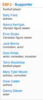
My Myers-Briggs personality type is an ESFJ. An ESFJ is sensitive to the needs of others and is responsible and loves helping others and making sure everyone feels welcome. ESFJ’s like following a strict code and get irritated when others don't follow the rules even if they are simple directions. They are organized and don't hesitate to plan an event to the last details. Quite a few football players and actors as well as comedians because ESFJ’s tend to be expressive and show emotions and live their passions. Such as Steve Spurrier, Sally Field, and Jack Benny.
I think my type description describes me pretty well. I love helping people and working with others as well as being a strict rule follower and do things the way I was told to do them. I am organized and a leader which is some of the main qualities of an ESFJ. I think this test didn't really effect the way I understand why I am the way I am. I have taken personality tests before and I think I have never really wondered why I have different skills or ideas than others.
I think my personality type clarifies the role I have in a team. I tend to be the one to step out and be a leader. I am a strict follower to the rules given and try to complete the project as quickly and organized as I can. I feel many people understand me in the past as someone who just tries to get everything perfect or be a “try hard” to always do the right thing. When it feels unnatural to me to not complete a task to the best of my ability by following the directions already given by a teacher.
I have learned from this assignment that its ok to have different personalities and in the end having multiples personalities in a group tends to complete activities better and more thoroughly.
Color Wheels
Graphic Design
Graphic design is used to communicate an idea with feeling behind it. Personally, I am interested in logo design. I found a blog where it talked about how to take your logo to the next level. You need to be able to come up with creative ideas that will not compete with other brands, but will stand out and make people more interested in your own brand. It also mentioned finding inspiration before starting a logo so that you have a basic idea before you start. Logos are also supposed to be distinctive, appropriate, practical, graphic and simple enough to convey a message. Making a logo too busy can confuse the audience and not make ur logo as beneficial.
Professional Article Review
There are a few points that surprised me in this article. For example, in paragraph 7 it talks about how your digital footprint can sometimes play a role in the admissions process. It was kinda shocking to think that colleges would notice this in the admission process. It seems more of a students personal life than there academic one in school, but however I still think it is a good idea to look at.
Chase Scene Project
Our assignment for this project was to create a chase scene sequence similar to ones you would see in the movies.
The first step in filming this project was to decide on the theme of our project. My partner and I decided on having a star wars theme. We decided on how to incorporate this theme by making the teacher Darth Vader and the student a Jedi. Secondly, we storyboarded the project and chose where in the school the student would run.
Next, once we had everything storyboarded we started filming. The filming process went really quickly but we had to make sure we took tons of footage and filmed in sequences to make the video more interesting.
And lastly we started the editing process. I experimented with different transitions as well as edits. In the video we used lightsabers so I watched tutorials on youtube on how to make the lightsabers glow. I eventually figured out how to edit it on final cut pro, but however it didn't turn out as well as I hoped because I didn't have lots of time to edit it. I also added star wars music as well as sound effects of lightsabers and voices from the movies.
Overall I think this project went very well, however I wish I incorporated the star wars theme a lot more in the actual running scenes. Also I needed a lot more footage with different angles and especially close ups.
By completing this project I learned new technical skills in editing as well as storyboarding to create sequences in videos.
The Six Shot System
1. Close up of the hands
The first shot in the six shot system is a close up of the hands or it could be of the feet. This shot is used to show what the person is doing at a closer perspective. Or if the shot is of the feet, it could show if the person is nervous for example if they were tapping there foot.
2. Close up of the face
The second shot in the six shot system is of the face. This shot should be pretty close to the persons face in order to show the emotion taking place in the scene.
The third shot in the six shot system is an over the shoulder shot. This shot is used to show a different point of view of the person in the scene. You want to take the shot over the same side as in the other photos above.
4. Medium Shot
The fourth shot in the six shot system is a medium shot. This shot should be taken from the waist up and like said above, it should still be taken off the same side as the previous photos.
5. Wide Shot
The fifth shot in the six shot system is a wide shot. This shot should be taken from the head to toe and should show the whole body.
6. Extra Wide Shot
The sixth and last shot in the sixth shot system is the extra wide shot. This shot should show the whole body as well as the scenery/what is going on in the background. For example, you can now tell that a student is sitting in a room with computers.